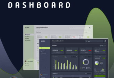
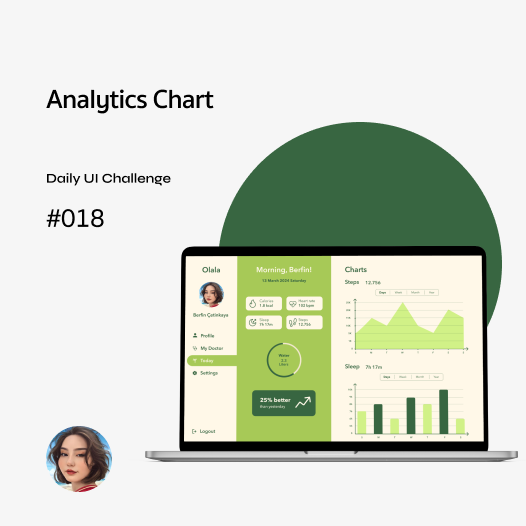
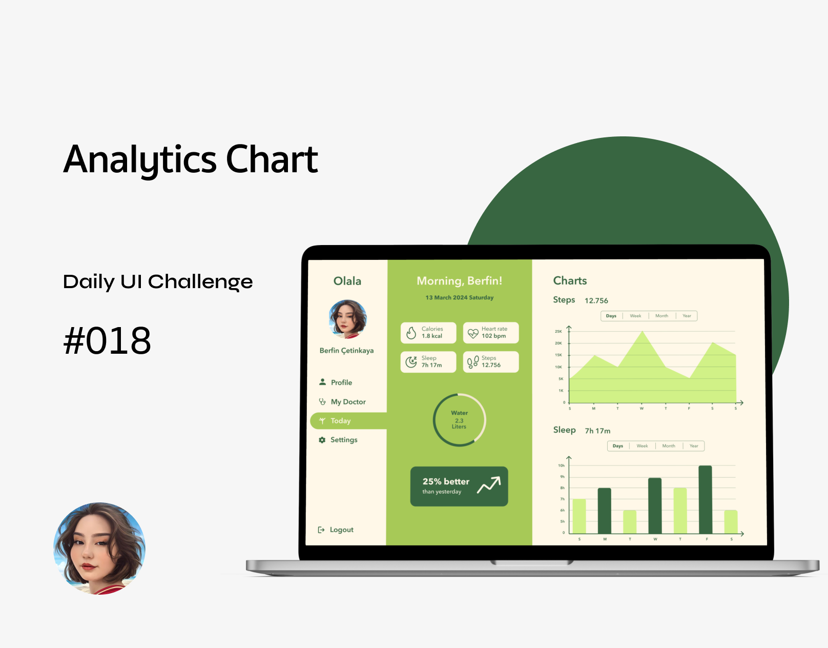
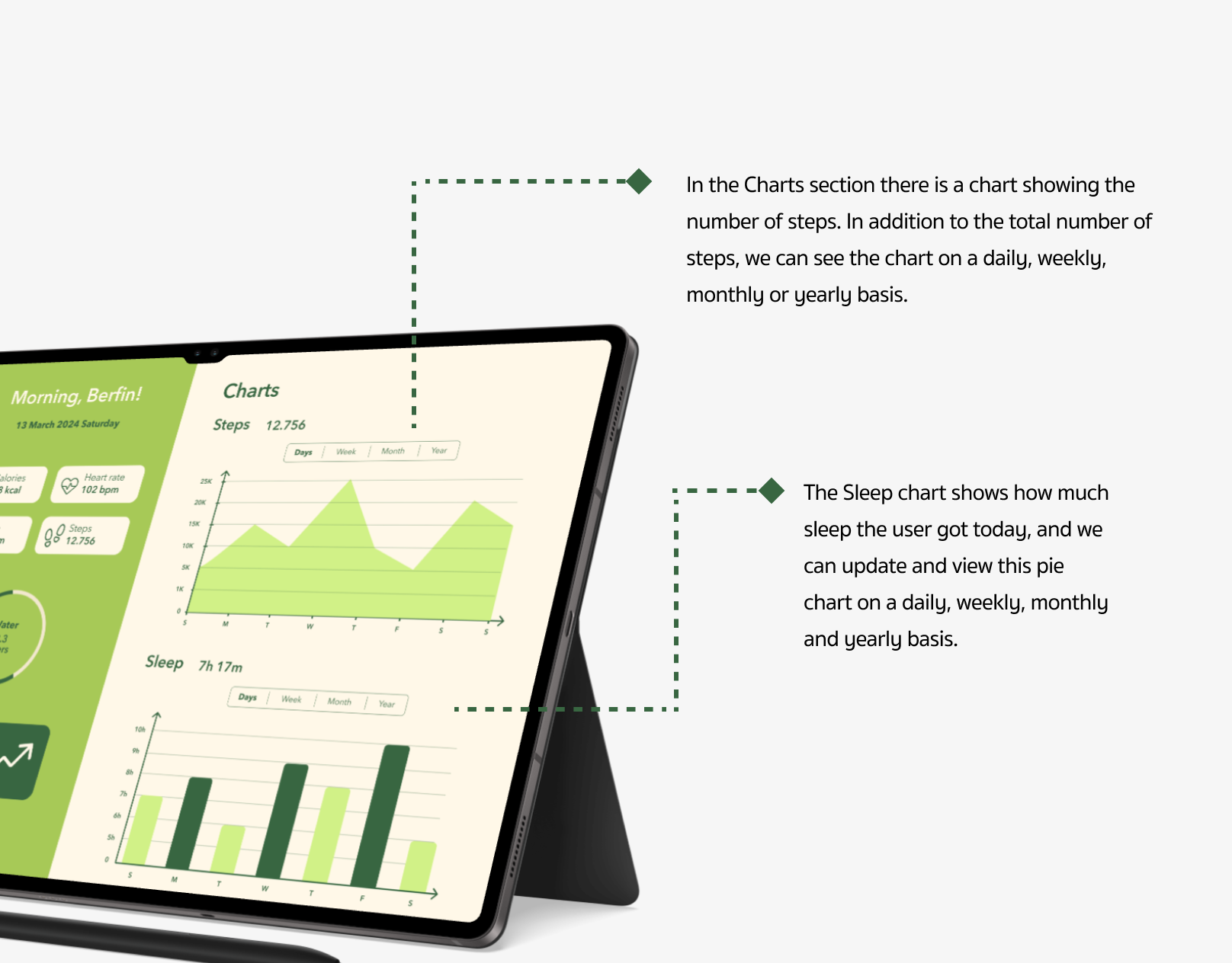
Web design for analysis charts should be simple and easy to understand, allowing users to grasp the data at a glance. Charts should be interactive, allowing users to dive deeper into the data (e.g. by hovering over it for more information). Colors should be chosen to distinguish between different data sets and avoid over-complexity. A clear hierarchy and intuitive layout is essential in dashboard design, as well as analysis graphics, so that users can access information quickly. Chart sizes should fit well into the overall page layout and any data updates should be clearly indicated.
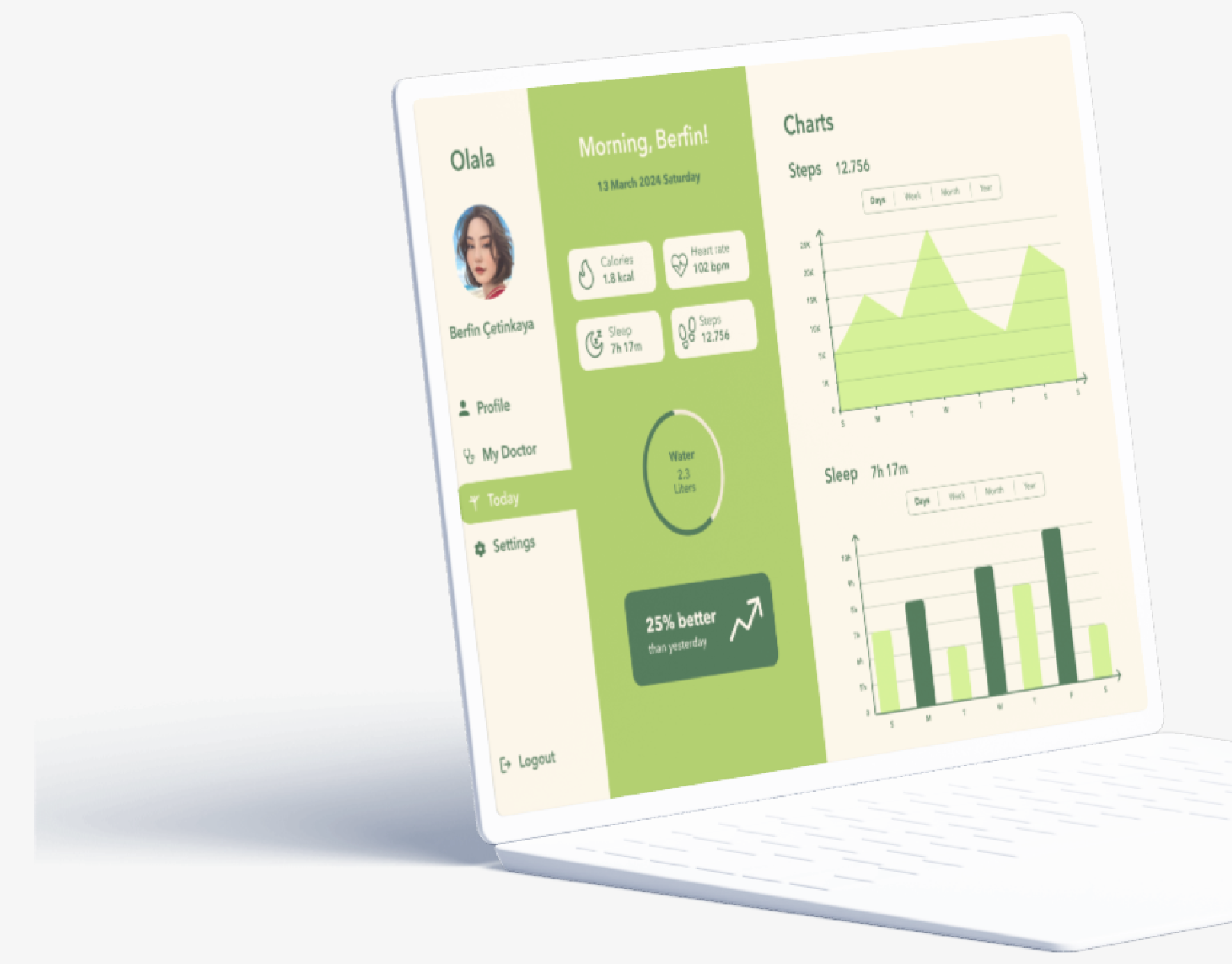
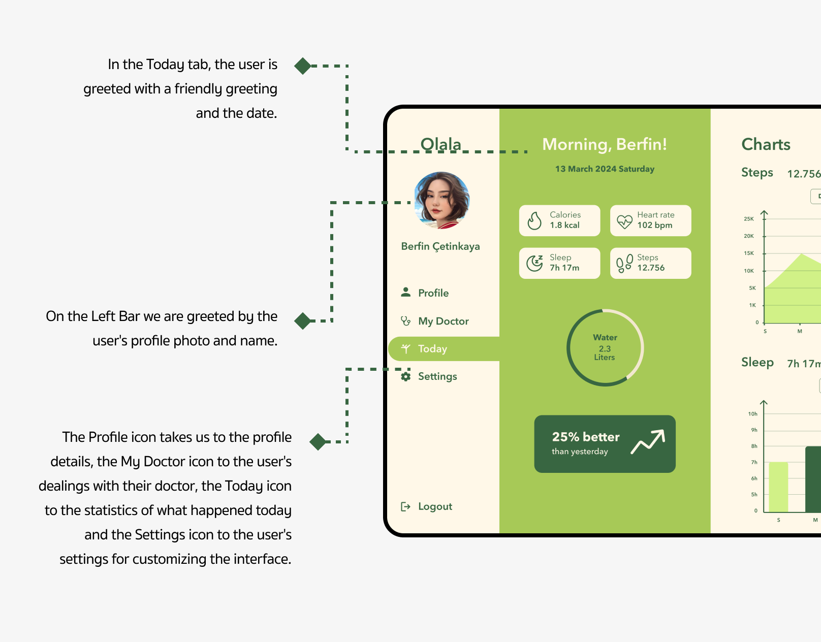
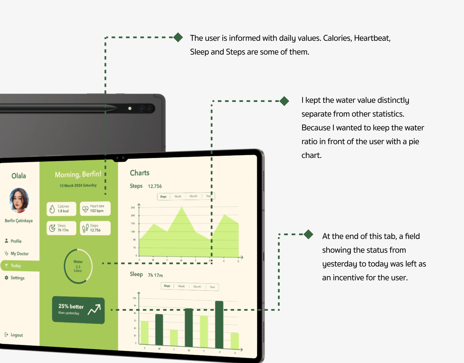
Analytical dashboards in areas such as health, sports and daily habit tracking now appeal not only to professionals but also to individual users. The data is presented in a simple graphical language, allowing users to better track their own progress. I started this project to design a user-friendly health analysis interface.