 .
.
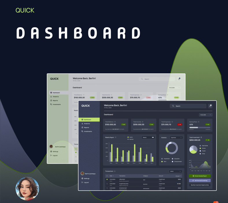
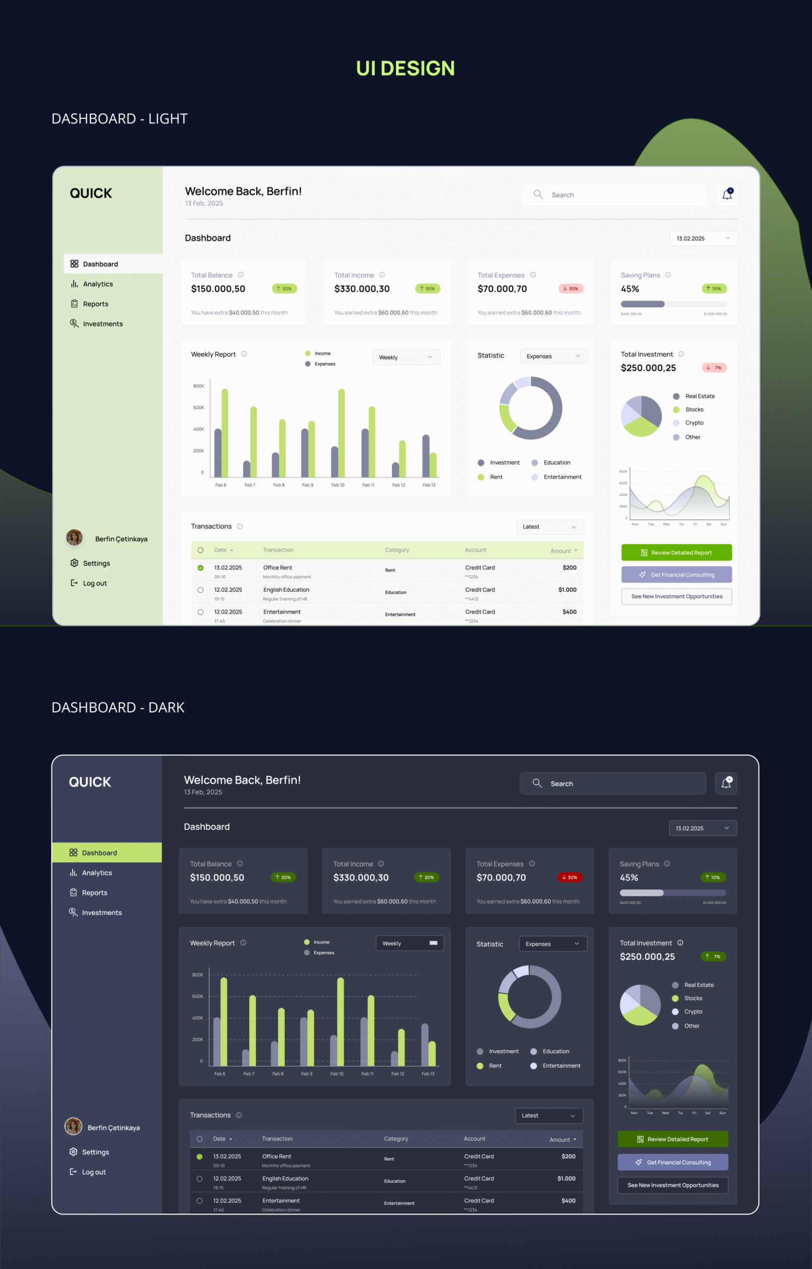
In this project, I designed a modern and intuitive Finance Dashboard interface that supports both light and dark mode to enhance user comfort and accessibility. The dashboard allows users to seamlessly track their total balance, income, expenses, and investment statistics through clean layout and engaging visual elements.
The design emphasizes clarity, functionality, and a consistent UI language, making financial management more approachable for everyday users. Charts, data cards, and action buttons are carefully arranged to provide quick insights while maintaining a pleasant visual rhythm. The green accent color highlights key growth metrics and ensures focus on important elements, regardless of the theme.
Key Features:
Dual-mode interface (Light & Dark)
Responsive and visually balanced card structure
Accessible data visualization (bar charts, donut charts, line graphs)
This dashboard is part of a larger effort to create tools that make personal finance management efficient, engaging, and user-centered.
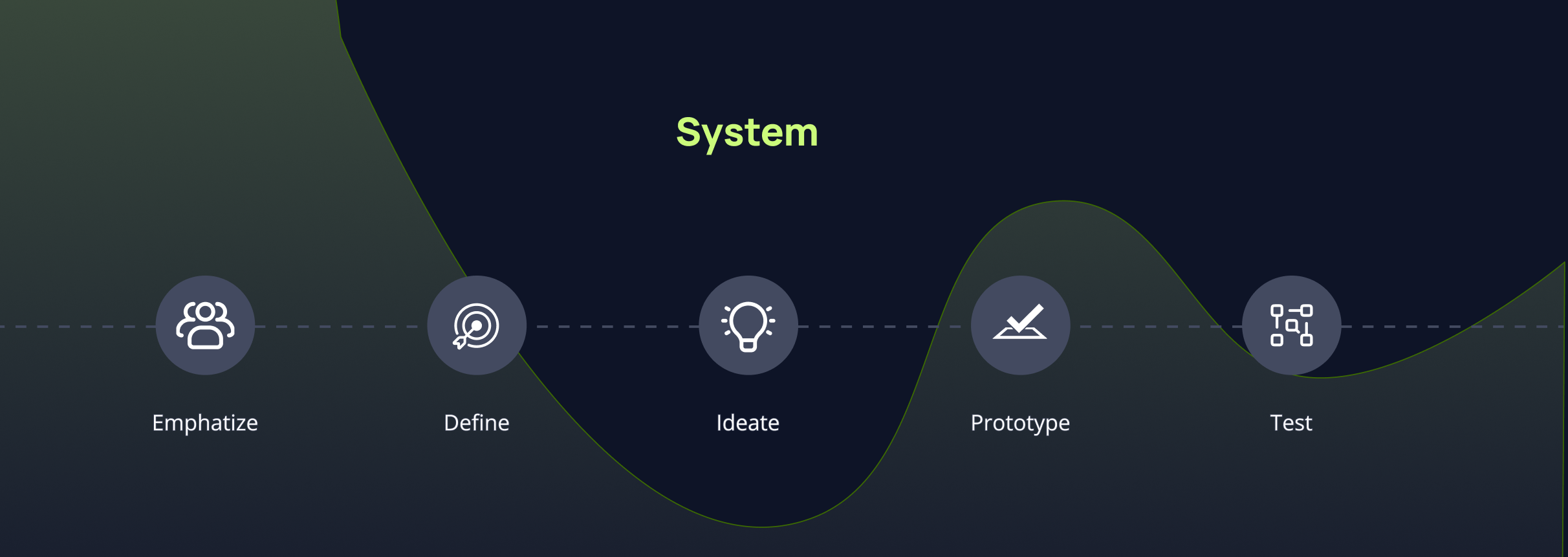
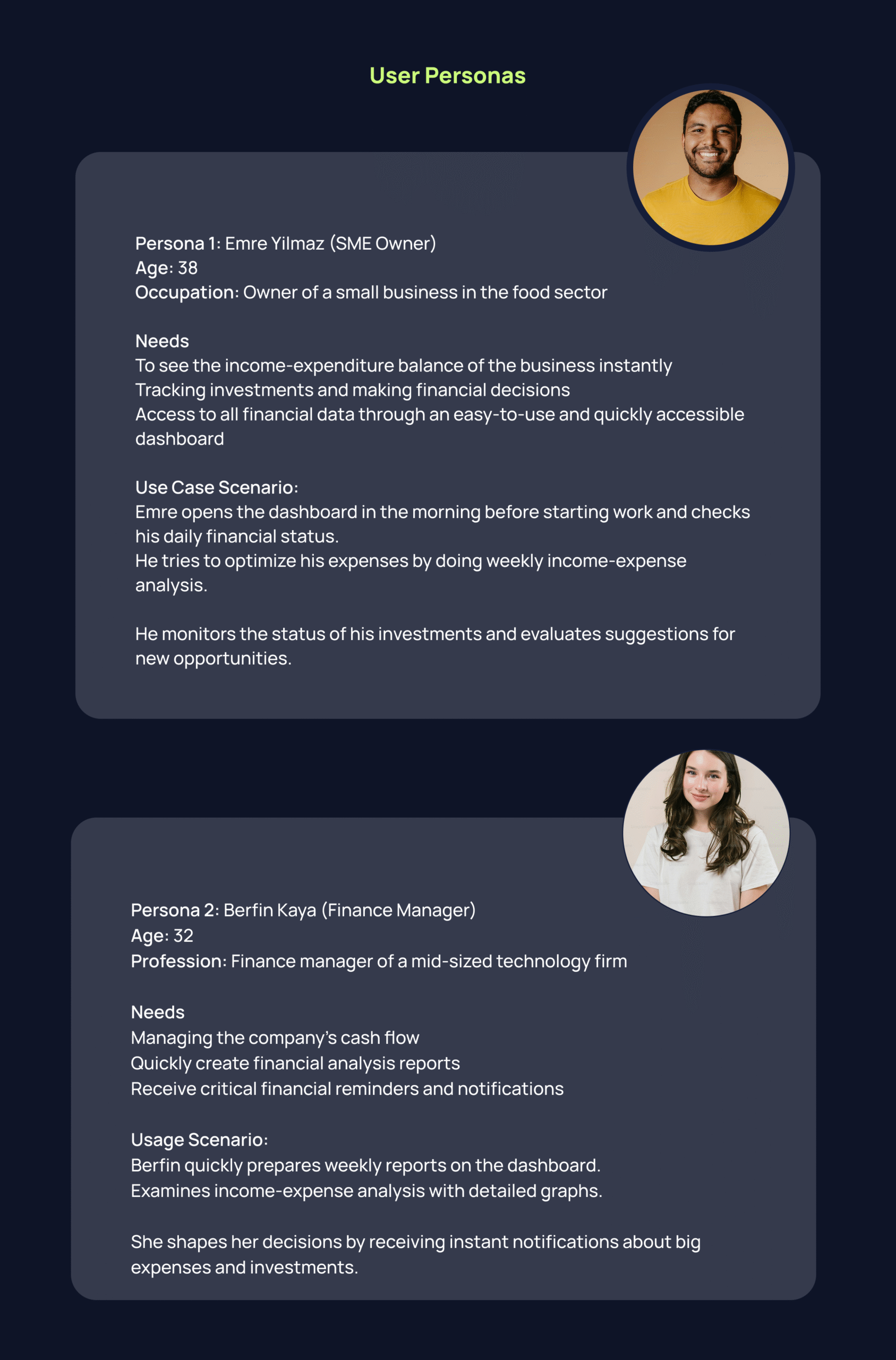
User Centered Design
User Centered Design is a design approach that puts the needs, expectations and experiencesof users at the center. In this way, the dashboard allows users to easily view, transact and organize all their financial transactions.
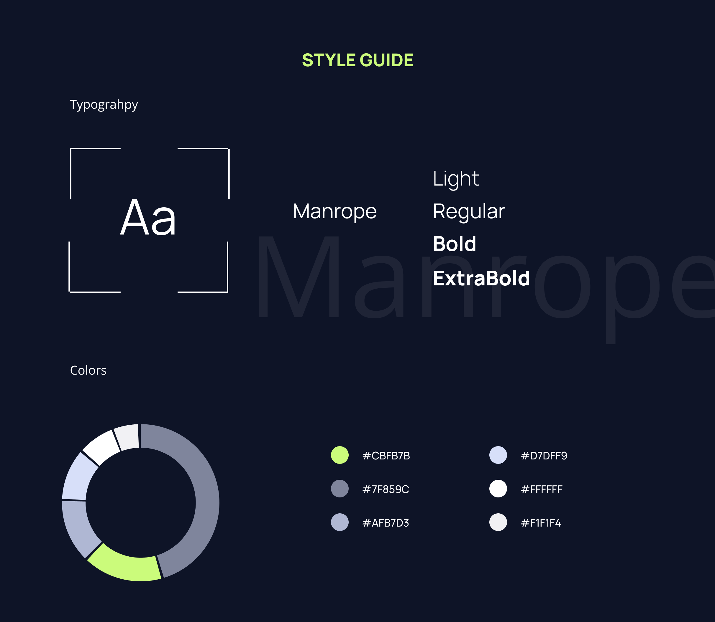
There are some reasons for my color choices. I chose the color #CBFB7B as a highlight, an attention–grabber. This striking color should be in harmony with the gray tones I used, #7F859C, #AFB7D3 and #D7DFF9, it should not irritate the user instead of creating dissonance and attracting attention while standing out. I used these close gray tones to make a difference in thegraphics and colortransitions in the tables I used. I was afraid that if I proceeded in a single color, it would look boring and monotonous. Normally, we designers do not prefer #FFFFFF color, but I needed a sharp white in the use of such light gray, so I chose this color. In all these color choices, I had to think about the concept and think about the user. When contrast was added to these two criteria, I created this colorpalette.
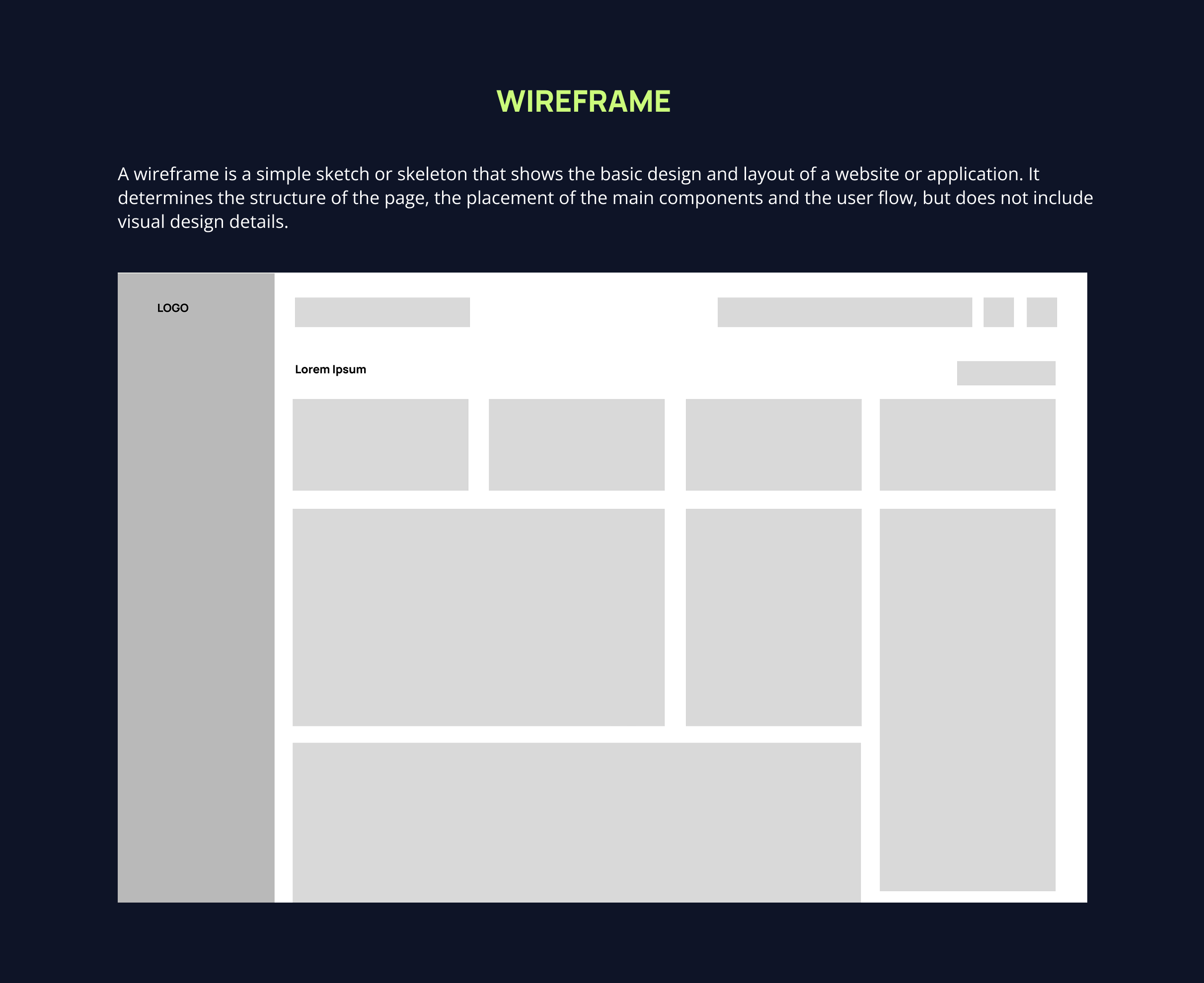
In this project, I designed afinancialdashboardinterface where users can track their financial data in a more effective andintuitive way. My goal was to simplify the informationarchitectureand make the data easy to read, while creating a visualhierarchy that guides the user.
During the design process, a UI kit was developed for both light and dark mode, with a good contrast balance. The colorpalette was chosen to make it easier to categorize data such as investment and spending. In the data visualization area, components such as bar charts, pie charts and line charts were included so that users can quickly grasp the current situation.
In terms of user experience, the interface was adapted to different screens with an intuitive navigation structure, simplified action buttons and responsive design principles. With this project, it was aimed to provide a user-friendly,accessible and aesthetic experience in an information-intensive field such as digital finance management.