Showing 7 Result(s)

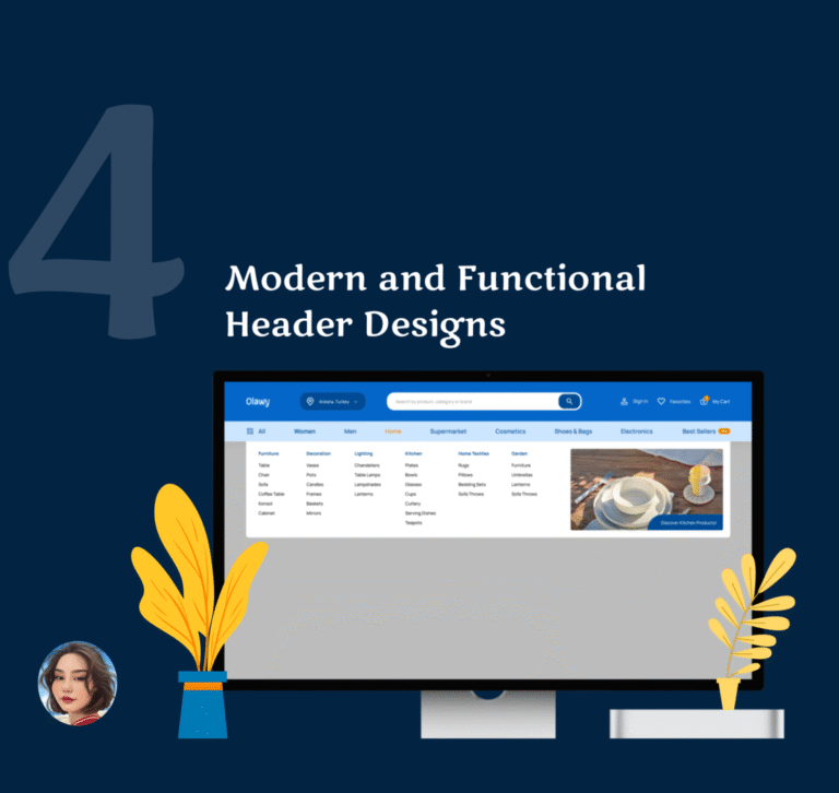
4 Modern and Functional Header Designs

The header is the first thing users see when they visit a website — it’s where orientation begins. A well-designed header builds trust, strengthens brand recognition, and sets the tone for the entire experience. It plays a crucial role in navigation, guiding users quickly to the most relevant areas of the site. A clear, intuitive …

4 Clean & Creative Footer Section Design

The footer is the area at the bottom of a website that is often overlooked but is critical in terms of user experience and SEO. The footer keeps users on the site, directs them, and explains the structure of your content to search engines. A well-designed footer significantly increases SEO value. When users still want …

QUICK DASHBOARD DESIGN ⏐ UI/UX DESIGN

. In this project, I designed a modern and intuitive Finance Dashboard interface that supports both light and dark mode to enhance user comfort and accessibility. The dashboard allows users to seamlessly track their total balance, income, expenses, and investment statistics through clean layout and engaging visual elements. The design emphasizes clarity, functionality, and a consistent UI language, making financial management more approachable for everyday users. Charts, data cards, and action buttons are carefully arranged to provide quick …

Leaderboard ⏐ Daily UI Challenge #019

  A game leaderboard design should be visually engaging, easy to read, and structured for quick comparisons. It should highlight top players with distinct styling (e.g., different colors, badges, or icons) while maintaining a clean and organized layout. The ranking, player names, scores, and relevant stats should be clearly visible, with real-time updates for accuracy. Responsive design is crucial to ensure usability across different devices. Additionally, interactive features like filtering, searching, …

Analytics Chart ⏐ Daily UI Challenge #018

  Web design for analysis charts should be simple and easy to understand, allowing users to grasp the data at a glance. Charts should be interactive, allowing users to dive deeper into the data (e.g. by hovering over it for more information). Colors should be chosen to distinguish between different data sets and avoid over-complexity. A clear hierarchy and intuitive layout is essential in dashboard design, as …

Direct Message ⏐ Daily UI Challenge #013

A web direct message application should be fast, secure, and user-friendly. It must include real-time messaging, read receipts, media sharing (images, videos, documents), notifications, and group chats as core features. Strong encryption (E2EE) and user privacy should be a top priority. The interface should be simple and intuitive, offering dark/light mode and other customization options. Mobile responsiveness, fast loading times, and low data consumption are also crucial factors.